1. In what ways does your media product use, develop or challenge forms and conventions of real media products?
In many respects our media product does use the forms and conventions of real media products to convey a greater sense of reality and genre. This is done because in keeping with genre is a vital part of audience recognition due to the viewers having a vague understanding of what they will be watching, and therefore, they are able to choose what they see accordingly. Considering our chosen genre is ‘thriller’, it is important that our media product contains certain themes to attune it. The thriller genre itself depicts that we use elements of suspense, tension, and excitement to express the themes of our film...and I believe that we did this.
The concept of the short film itself articulates that these elements must be used in order to secure an attentive audience. The concept of the film itself has strong conventional parallels to real media products. The idea that the main character is psychologically unbalanced is a common narrative structure within thriller films. In this respect, the audience are asked to become an active party in watching the film, so they can work out what is going on, and who to trust - another more conventional concept (strong influences from the 'master of suspense himself - Hitchcock).
Use of codes and conventions
The concept of the short film itself articulates that these elements must be used in order to secure an attentive audience. The concept of the film itself has strong conventional parallels to real media products. The idea that the main character is psychologically unbalanced is a common narrative structure within thriller films. In this respect, the audience are asked to become an active party in watching the film, so they can work out what is going on, and who to trust - another more conventional concept (strong influences from the 'master of suspense himself - Hitchcock).
Use of codes and conventions
Below is a video analysing how we fitted the codes and conventions of the thriller genre:
In this video we, as the producers illustrate the components of the film that could be deemed conventional of the thriller genre, and how they were used effectively.
Tension
Below are some snap shots from the film which show moments of tension, key for the thriller genre to be present:


This snap shot uses the red pen hitting the clip board to represent Johnny's mind becoming focused. This works highly with the elements of suspense because with his focus comes the unfolding of his past, and why he's mentally unstable.

This snap shot on the left exhibits the point in which the psychiatrists character asks Johnny to explain how his mental illness began. This is a tension building moment as the audience wait in anticipation to learn about his past; as well as not being sure whether he'll actually tell say.


The snap shot on the left shows Johnny's first break down into insanity. It is a tension building moment because the audience are expecting some sort of mental explosion which will lead to him obsessing over numbers and symbols.

The snap shot on the right is a cut away to the psychiatrist meeting from the London flash back. The use of the cut-away is to visually enhance what Johnny is saying as he explain the pain in his head. This shot ultimately reinforces his insanity, and creates a more forceful visual image.


The snap shot on the right is a close - up of Johnny strangling his girlfriend. The shot reaction shot effect used within this sequence enhances the climactic tension in the scene, and confuses the audiences feeling towards Johnny.


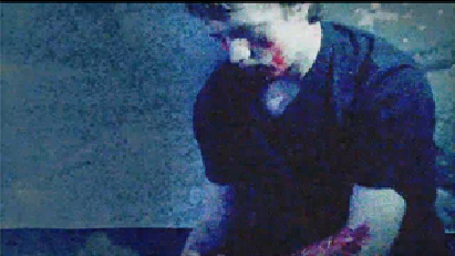 The snap shot on the left is of Johnny's character in the asylum. The camera lingers on the shot, zooming in slowly to make the realisation more visually powerful. The shot is tinted blue with a grainy effect over the top to create the sense of the dreamlike state. The over - voice increases the tension of the scene, and a glow is masked over Johnny's face to make him the focal point.
The snap shot on the right is of the psychiatrist telling both Johnny and the audience know that he is actually dead, and that he is really the devil. It therefore becomes apparent that the whole short is based in a state of limbo which creates a lot of tension for the audience.


The snap shot on the right is the last shot of the short. The film ends on this shot because even though he hasn't killed his girlfriend in reality, it lingers on Johnny's potential to carry out the murder: therefore concluding on the bleak thought that he has an inevitable downfall.
But other methods were also used to convey a sense that we are using the conventions of real media products. For example, by colour correcting some of the scenes we were able to de-saturate the atmosphere and therefore create a sense of greater tension. Below is a clip of colour correction being used on a flash back scene:
Here are some snap shots also of colour correction being used throughout the piece to reinforce the bleak mood which reflects that of the main character:

The use of the tint effects in the studio scene, was to utilise the idea that this is a warm place like a psychiatrist's room should be. However, the use of the black and white tint was to, at the same time make the room fall slightly short of being completely comfortable.

On the left is a close - up of the specific colour correction used to produce the desired effect. All the studio colour correction was duplicated on each shot, so there would be consistency throughout the product. This continuity was vital to create a more professional looking product, which therefore increases quality of the film.

The office flash back used de-saturated colours to present a sense of a memory. This was done by tinting the shots black and white, and adding a slight blue tint to soften the tones of the scene.

The image on the right shows a close - up of the colour correction effects used within the office scene. The colour of the blue and percentages for each were carefully planned to create the best overall look.

The image on the left shows the flash back scene of the main character murdering his girlfriend.

This image on the left is a close - up of the colour correcting effects used to create the sense of a flash back, and also anticipation for the pending murder.
Symbolism through props
The symbolism used throughout the piece is also quite conventional. For example props were chosen to symbolise more complex thoughts in the main characters mind. Below are some snap shots of the film were props are used to symbolise character and narrative development:

Snap shot – the paper clips were used to present a sense of a scattered mind. When Johnny knocks them over it is to symbolise how he has crossed the line from sanity to insanity.


Snap shot - the image on the left shows Johnny about to drink a glass of water in the London scene. This prop was chosen as a link between both flask back scenes, and a subtle indicator of his moments of break down.

Snap shot - the image on the left shows Johnny's about to drink the water in the murder scene. The taking of the drink is a symbol of his insanity - bargaining with the devil so to speak.

Snap shot - the image on the left is of the ambition poster prop in the closing scene of the film. It is an ironic pun about the fact that if he achieves his dreams, he shall become mentally unstable.
These props fit the conventions of real media products because even though there is variation, a sense of reality must be retained to help the audience undergo a suspension of disbelief.
Locations
The locations used themselves could be deemed as conventional to the thriller genre. Here are some snap shots of blockbuster thriller films which place emphasis on some of the locations we also chose to use:

 Snap shot - the image on the left from the film 'Zodiac' is another example of the office like set-up which we also use in our production. It is evident from this image that the budget of this film was smaller due to the small scale office for such a large case (unlike Se7en). In this respect, this image depicts more closely what we achieved as a similar location (with little budget).

Snap shot - the image on the right, from Hitchcock's film 'Spellbound' shows a psychiatrist analysing the main character's mental well-being. This is a conventional aspect of thriller films due to the mystery of the character's mind. The audience are therefore lead to distrust the images on screen before truth and clarity is restored (equilibrium occurs).


Below are some snap shots of locations similar to the above used in our short film:

Snap shot - the image on the left shows the psychiatrist meeting in the short film. As in the thriller examples above, it is also evident that the psychiatrist (through body language) is in a place of power.

Snap shot - the image on the right displays the office flash back in the film. Note how both the thriller examples and this image shows certain conventional mise-en-scene; such as papers, dull lighting, and office attire.

Snap shot - the image on the left shows the house location used in the short film. It increases a sense of realism into the film, and further helps the audience to connect with these characters as "real people".
Effects
The matrix effect was used to create a sense that this main character is insane. Here is a video of the Matrix effect used in the original feature film:
Influenced from the film 'Matrix' we decided that the falling numbers would be an effective method of putting this "loose cog in the brain" theme across. However, the difference being that instead of symbolising a regimented and restricted society full of inscription, we were using the effect to symbolise an individuals mind being one of complexity and mental instability. Below is a video of the matrix effect being made on AfterEffects:
Influenced from the film 'Matrix' we decided that the falling numbers would be an effective method of putting this "loose cog in the brain" theme across. However, the difference being that instead of symbolising a regimented and restricted society full of inscription, we were using the effect to symbolise an individuals mind being one of complexity and mental instability. Below is a video of the matrix effect being made on AfterEffects:
Below is an commentary of the After Effects being used within the final video. It highlights the different ways our film (in terms of After Effects) fits the codes and conventions of the thriller genre.
Costume
The costume choices within this film fit the codes and conventions of thriller films. Here is a diagram of recurring costumes in thriller films:


We've noted that may thriller films often put an emphasis on suits, and this influenced our costume decisions. Here are some snap shots of costume sets used regularly in thriller films:

Snap shot - the image on the left is for the film 'Se7en' which is a acclaimed detective thriller. The main two characters (Morgan Freeman and Brad Pitt) are cops, and therefore wear office attire. Even though Johnny is not a cop, he is a business professional, and therefore wears similar costume to give a distinguished impression.

Snap shot - the image on the right shows the character Lecter from Johnathan Demme's 'Silence of the Lambs'. He is wearing white which is ironic of his 'blood-stained' past. Johnny wears a white shirt also in the business scene to suggest his conflict with morality.

Snap shot - the image on the left shows Jim Carrey's character from the film 'Number 23'. We took inspiration from his casual grey T-Shirt in his writing break-down scene. It was important to create the sense that this character looks by most accounts an average citizen of society, to increase audience relatability.
Below are some snap shots of costume choices made similar to the above in our short film:
 Snap shot: the image on the left is Johnny's character wearing professional business clothes. This attire presents him as an intelligent and ambitious young man, which immediately instigates ambiguity for audience perception. The combination of the white and black also symbolise his conflicted morality.
Snap shot - the image on the right shows johnny in the asylum. We decided to use a black top as it would contrast his innocence of the past. This change is also significant as it represents Johnny's downfall

Snap shot - the image on the left is directly influenced from the image of 'number 23' above. We chose a grey T-shirt to symbolise a mid-way point in Johnny's downfall. After this scene is over and he kills Claire his transformation into darkness is complete; and his death proceeds.
Characters
The characters themselves are in many regards quite conventional of thriller films. Below is a diagram of some of the characters are synonymous with the thriller genre:


The psychiatrists character uses his mental stability to create an air of power and influence over Johnny's character. He is presented as an almost devil-like figure, who seeks to inflict suffering upon the corruptible Johnny. This type of character appear in many thriller films, as he is the villain who tries to lead the morally conflicted character along the wrong path.
This soundtrack is conventional because as expected with sound from a thriller film it builds tension, and increases a sense of mystery of the characters and place.
Below is a PowerPoint explaining the conventions of a radio trailer:
Below is the radio trailer for our short film 'Purgatory':
The radio trailer we created for the short film in many respects fits the codes and conventions of the thriller genre. We use a tension soundtrack alongside a clock ticking to heighten a sense of mystery and suspense over the film. Like all radio trailers, we conveyed the important basic information about the film itself such as the title, and date of release. A narrator was also used to convey a sense of what the plot-line what about; and segments of speech from the film characters was also used to aid the listeners. We thought these aspects were all important because they intertwined to create a finished product which composed of both cinematic tension and important information for potential listeners.
Below is a video evaluation of how our film poster fits the codes and conventions of the thriller genre:

Snap shot - this image of the poster from the film 'The Shining' shows a close-up of the main character displaying an aggressive facial expression. This is very much in keeping with our idea for our short film poster, because we also wanted to convey a sense of the film having a main character with a questionable mental state.

Snap shot - this image of the poster from the film 'the Silence of the Lambs' uses a close-up image similar to our short film poster. Much of the poster draws parallels with our short film poster in terms of layout. The main title is also at the bottom of the page with a large font which is also something we have decided would fit most appropriately.


Below is a snap shot of our 'Purgatory' film poster:

Note the close-up image of this main character (very similar to the above), and the large font with indicate a clear sense of what this film may be about, and its genre. The mise-en-scene of the character also draws an immediate sense of confliction, as the purity of the white shirt is challenged by the dangerous blood on his face. The design of our short film poster therefore fits the codes and conventions of the thriller because we include many of the attributes typically synonymous with this genre. We found from research that the most common of these was the close-up of the main/or most complex character to establish a sense of narrative and characters within the film. The title was also very large and clearly visible on the poster so the viewer can easily draw a quick connection between the atmosphere of the image and the title. We therefore included these typical qualities so that the audience are informed immediately of the genre and sort of narrative they may be viewing if they ever saw the film.
Challenge
In some respects our short film develops and challenges the codes and conventions of real media products. Below is a video analysing how certain aspects of the short film challenged the conventions depicted by its genre:
SoundtrackIn some respects our short film develops and challenges the codes and conventions of real media products. Below is a video analysing how certain aspects of the short film challenged the conventions depicted by its genre:
The unconventional nature of the ending soundtrack creates a sense of remorse, and blackens the entire short in empathy. This could be seen as unconventional due to the sense of slowing down the plot to a halt, even though it is on a twist. Below is the soundtrack used in the short film:
Matrix Effect
Even though the Matrix effect originates from a very famous hybrid thriller film, we use the effect for very unconventional purposes. Instead of giving visual aid to a computer programme, we use it for the purposes to reflect Johnny's mental instability. We thought this would be a very original and interesting way to convey these ideas, and below are some video's of the matrix effect in use:
The video above is the Matrix effect in use for the title sequence. The effect indicates the significance of numbers throughout the film, and also the 'thriller' genre. This particular video is unconventional because most title's just use clear block text as an introduction; however in our case we thought it would be appropriate to show the title clearly at the same time as giving the audience the sense that this film is going to deal heavily in complex characters.
The video above represents the numbers and symbols that Johnny can see moving around in his mind. Even though it is unconventional to show thoughts in a visual manner, we thought it vital in this case to have a visual aid. This is because we felt that the viewers should be able to see clearly what Johnny's problem is, so they can focus on other issues such as how he will deal with them.
The video above shows the effect in use when Johnny has just murdered his girlfriend Claire. Even though unconventional, we thought it important to visual indicate his mental breakdown - and furthermore suggest that his visions of numbers, will inevitably be his undoing.
The image on the right shows the effect in use when Johnny's character is dead in the asylum. This symbolises how his mental instability has finally lead him to the ultimate downfall (death). It is unconventional in the sense that film don't usually use obvious special effects to heighten the emotion of a death in a thriller film; how we thought it a symbolically significant framing device for the narrative development of the film.
Radio
This ch alleges the code and conventions of traditional radio trailers as we use the effect to parallel its use in the film. The ticking clock is also particularly effective because we made it gradually slow down to build a sense of tension-gripping atmosphere in preparation for the film.
Below is the our short film poster:
Unlike most other thriller posters, we decided that instead of using traditionally low level lighting to convey the darkness of the film we would use the connotations of white (purity) in contrast to the red blood to convey an initial sense of a complex character.
It is also relatively unconventional in recent times for film posters to display more than one review and rating; but considering that this film is intended as part of independent cinema (to be shown at films such as Sundance) we thought it important to emphasis any accolade it may have obtained.
Under-laying the image with numbers and equations is an unconventional effect for film posters in general. However, in the case of 'Purgatory' we thought it important to establish the cause of the running theme of mental instability.


