Sunday, 28 April 2013

Evaluation Question Four

4. How did you use new media technologies in the construction and research, planning and evaluation stages?


With the ever integrating forms of media available in the commercial world, it was important for us as media students to grasp as many opportunities as possible to develop our skills; and ultimately create a more dynamic and professional piece of work. With a basic knowledge of the technologies available (AS year) we could experiment with a higher level of equipment and techniques. This can be seen through all stages of production; however it is most visible in the actual construction of the products because there was a lot of chance to experiment with camera techniques (the French tilt), and use the editing facilities to an optimum level (the matrix effect in After Effect and use of colour correction and sound editing in adobe Premier).


Research

First of all we analysed our previous work (from AS year) to gain a perspective on were we were up to in terms of skills, and what we needed to improve on.


Below is the opening sequence to the film 'Gemini', which was our main product for last year's coursework:


After looking at the piece in detail, we found some aspects of the opening which could have been ehanced by our more experienced selves, and we took these points on board when completing our A2 Media piece. Aspects such as the colour correction which in our AS production we only used in a limited manner, the soundtrack is a little distorted by the lack of post-production effects, apart from the credit sequence there is no other use of AfterEffects - these are the elemts which I believe we heavily improved on.


Other research:


'Alone' by Larry Molly


This short ('Alone') is a fantastic piece of coursework because the audience are given small clues as to the story-line of the film, but never really explicitly told. The use of artistic shots throughout the piece is also worthy of note as it increases the tension and mystery surrounding the young child's character. Using the website (YouTube) we were able to research pieces like this which were inspirational in themsleves. We wanted to en-corporate this idea of hidden messages into our use of the thriller genre as we also strived to unravel the narrative slowly, and with caturvating suspense.


'Networked' by Jack Thompson


This short ('Networked') uses suspense in a similar way to 'Alone'. The concept of the film itself is strong because it takes the idea of what everyone in the modern era takes for granted (the protective shield of the internet) and turns it into a very real and sinister form. We use a similiar idea in the respect that we take the protection of a dream state and use it to question how is may corrupt, or even push a person to murder.


Below we illustrate the use of  different new media that technology we employed to complete the product and ancillary products of the short film 'Purgatory' in the time frame required:


Video Editing


The post-production video editing for our short film 'Purgatory' was predominately completed through the adobe software called 'Premire'. Below is the video commentary (part one) which comments on the use of this software throughout the short film:


Below is part two of the above video commentary (use of adobe Premire):


Below is a video of us editing in Adobe Premire to create the final product:


The video above shows how we just the technique of colour correction to match the suspensful tone of the film. As shown in the video, we used tints of black and white/ light blue, and the brightness and contrast tool to create the appropriate visual style. It is important to note how we copy and pasted the exact tone of each colour onto the next piece of footage to retain a consistant aesthetic throughout the film.


Below are some snap shots of editing techniques used in the Premire editing:
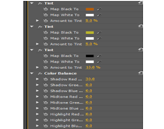


The snap shots on the left shows the colour correction editing technique in use. This particular piece of video is when we filmed in the studio for the psychiartrist section of the video. As shown in the image we tinted the shot with black and white to create a uncomfortable tone to this scene. This was done for the purpose of creating an atmosphere which was unnatural and distant from the seemingly "friendly" setting. On top of this, we also used a yellow and orange tint on these particular shots to give the scene a sense of artifical comfort. The tints gave the ability to make the scene look almost how it is supposed to, but at the same time strip it from natural warmth.


The snap shot on the left also shows the colour correction tool in use. In this scene (unlike the studio shots) we wanted to visually enhance the concept that this was a flashback by draining the scene of colour and adding tints to give the scene a trance-like atmosphere. For this (as shown on the left) we initially used a black and white tint to remove the shots of colour. Then we washed the individual shots with a light blue tint which gave it this "trance-like" quality. We thought this was an effective use of the media available as we were able to heighten the scene's visual style, and therefore aird the entire film to look more professional.


The snap shot on the left shows the use of the colour correction tool in another scene. In post-production we found that this scene looked a little grainy, so this particular scene lent itself quite heavily to Premire. The four grids on the left show how we adjusted the colour and noise of the shots to maximise on a sense of realism.
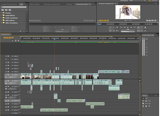


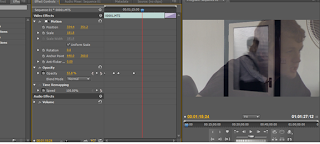
The snap shot on the right shows use of the transition effect on a shot in the film. Here a dip to white is used alongside a cross-dissolve to optimise on the image that Johnny is having his breakdown. This visual enhancment heightens the tension of the climactic moment as it seems as though he is of 'two minds'.


The snap shot on the left show the transistion from the studio scene to the business scene. We increased the time of this transistion so that the scene change was more obvious. We also put a dissolve effect at the end of this so that it would run more smoothly.


The snap shot on the right shows how the sound levels were contolled to enhace the video overall. We key-framed the main music track so that it became gradually louder when it started. This was also done in reverse at the end to create a continuatious effect threoughtout the piece, which was in turn heighten the overall sense of realism.


The snap shot on the left shows how sound effects were adjusted in post-production to create the on-screen atmosphere we intended. This last scene was probably the most challenging sound-wise as we had to co-ordinate the echos of the psychatrists voice (previous scene) with the diegetic sound on the next next scene, and then gradually introduce the ending soundtrack so the first lyrics of the song would begin at the start of the credits.


The image on the left shows how we used the technolgy of Adobe Premire to compress and export our final edit. This process took around three hours to complete as we tried to retain the highest resloution possible. Once the exporting was complete we were able to watch the piece in QuickTime and WindowsMediaPlayer to see if it ran smoothly. Once we were satisfied with all aspects of the production we then  imported the file onto YouTube so we could obtain audience feedback.


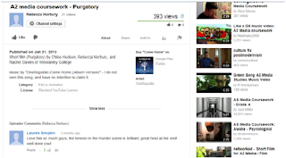
The snap shot on the left and below illustrate the final product having been uploaded onto YouTube. This was a fantastic method of gaining audience feedback as it was accessible on a world-wide scale. Having gained the feedback we have now also gained objective opinions on what the strengths and weaknesses of the piece may have been. This will hopefully lead to even more improvements when using these forms of technology in the future, and increase our chances of success in this industry.


After Effects:


Below is a commentary to our coursework in terms of the use of after effects why we have used it and process went though to achieve the final product.


Below is and interview about the after effects process:


Our original title was "The Inner Crossover" however, after research and discussion we felt that the title was too long and un-intriguing for our target audience therefore we changed it to Purgatory.


To achieve this title sequence was fairly simple after watching various beginners after effects tutorials. Here is an example of one which was very helpful to us as it acted as a step by step guide:


Below is an example of the Matrix Effect technology being put to use in our final product:


Equipment


There were many forms of technology used during the research and planning stages of our coursework. We used Blogger to document what we found from our research such as conventions of our chosen genre, audience feedback and analysis of existing media products. Blogger was helpful as it enabled us to keep track of our work and spot common trends that we could incorporate into our own products. We used websites such as YouTube, Virgin Media Shorts, and Short of the Week which were key resources when looking at existing short films of a similar genre to ours. Google was important when it came to researching existing film posters. We could identify typical colours, fonts, codes and conventions etc. used in current psychological thriller posters such as Memento and Se7en. These technologies enabled us to create realistic and professional-looking final products.


Photoshop

Adobe Photoshop has been incredibly useful throughout the production of our coursework as it was used to produce the poster. Photoshop enabled us to manipulate images and text and adjust the colour and lighting to acquire the final result that we wanted. It was very simple for us to modify the brightness and contrast of the image to achieve the right look and feel of the poster. Altering the size and scale of the image was made easy by using the resize and crop tools. The magic wand tool allowed us to cover up any imperfections on our images such as blemishes and shadows, this enabled is to get a more professional-looking image. By using different combinations of tool such as lighting and masking options, we were able to get our desired effect on our main image. The editing options that Photoshop offers are superb and they helped us to produce a realistic and professional-looking film poster.


Facebook


We received audience feedback by uploading our products to Facebook and asking our friends to give their opinions on the piece. The criticisms we received enabled us to alter our products to make them more successful.


Questionnaire - Film Posters

Before we begin producing our poster, we have decided to create a survey on surveymonkey.com to find out a little more about our target audience and to see what they want out of our product. We asked things such as what they think are important key features of a poster and if they think a poster is important in the advertisement of the film. 

Here is a link to the survey: http://www.surveymonkey.com/s/9YPHT96

The results of this questionnaire will enable us to identify the key features that we will need to include in our own poster. By getting audience feedback, we are able to make our product as successful as possible as we are able to see, first hand, what our target audience want.


The importance of Photoshop

 
Once we had selected a photo, we needed to apply effects that made it look professional and realistic. We used the lighting effects to create a shadowed background and make our actor appear as if he was in a spotlight. This gave the image a more official feel and we all feel really happy with how the photo turned out. 


We used the text tool to insert lots of numbers and symbols to the background of the image to carry on our theme of numbers and eqations that Johnny sees in the film. We then used the magic want tool to remove any excess symbols that we didn't need such as the ones covering his face.


Style settings allowed us to give the text we used on the poster a more preofessional look. By adding a drop shadow or a glow, we could make the text look more authentic. It enabled us to get a more realistc-looking poster.


The editing tools that photoshop have are incredibly simple to use and result in a product being created quickly and easily yet they look professional at the same time. We are really happy with our final product and feel that photoshop has been a superb programme to use for this particular piece of our production.

Props


As the foundation of this short film will be set in a psychiatrists meeting room it is important that we meet the normal requirements of this set. As exhibited below it seems as though the general stereotype of these meetings seems to happen in a room with three main props: a chair and table for the psychiatrist, and some sort of sofa for the patient. The vital difference between the stereotypical mis-en-scene of this room, and the room we will be setting up is that we want to create a sense that this is not a conventional meeting - to give the impression that something isn't right here. Through soft lighting, and minimal props we hope to achieve this goal. For example the room we have chosen to use has a white wall and dark flooring which in contrast to say the image below, gives off the sense that this is not really a place to feel comfortable. This is to reinforce the idea to the audience subtly that this scene may not be real.


Other, smaller props will be vital as mis-en-scene in this psychiatrist meeting. Within this scene we have Johnny - a mentally unstable character who spends a lot of the scene unfocused and apparently manic. We have decided to convey this idea through this character focusing briefly on random objects in the room which may be creating some sort of minimal diegetic sound. We have chosen these objects to be a clock which shall be hanging above the psychiatrists head (ticking can be exaggerated),a stand alone fan, and a pen and notepad which the psychiatrist will be holding (emphasis on the diegetic noise created when the psychiatrist rhythmically hits the pen against the pad when waiting for johnny to respond). 


The first flash back scene will be set with an office set up (as shown on the right). This means we need to carefully pick and choose the mise-en-scene with accommodates this need. In contrast to the psychiatrist meeting, it's the detail of the props which will make this scene believable. The image on the right was chosen because we believe it encapsulates all the standard office conventions - conventions which we wish to stick to. For example having two chairs face the larger more empowered chair will work well with the concept of Johnny being held up waiting for a big shot business man to arrive. The desk also holds all the ingredients which we wish to also use: the phone, the pens in cup, the writing pad, the computer, the file holder, and even the plants -  which will add the touch of believability that someone works because they want to create a more homely atmosphere. 

However, there are also a few other prop ideas we have for this scene which are not shown on the image above: firstly - Post-it notes because we think putting them next to the phone would also increase a sense of reality, files and papers that we can put inside the desk drawers, and a few oddments such as elastic bands, staples, and paperclips - all working towards the impression that someone do indeed work in this office daily, and therefore leaves behind personal marks.     


The second flash back see's the decline and break down of Johnny. In his living room he hits his girlfriend over the head in a moment of insanity. This whole scene therefore requires a very strategic placing of props. For Johnny to set up an area to immerse himself in equations, he needs a large piece of paper or whiteboard to write on, and blue-tack to stick it one with. He also needs a breakaway glass which he can smash to the ground in annoyance, and a object which he can hit his girlfriend over the head with. Initially we played around with the idea of getting a separate breakaway glass object to kill her, however after exploring possible safety risks, on top of the believability of there being another glass, we have decided to use a TV remote controller to stage the murder.  


The third and final flashback of the short film is of Johnny in solitary confinement inside the metal asylum. In many ways this is the most simplistic scene as there isn't anything in a confinement cell, however we want to create the affect that the cell has padded walls (as exhibited on this right). To create this sort of affect we hope to set up two mattresses to line the walls of the room the shot will be in. We believe creating this affect will create a greater sense of how lost in reality Johnny's character really is.  

The ending scene of the short film see's Johnny waking up from this nightmarish dream; but still leaving the sense that somehow Johnny's real life character has the potential decline into insanity. On his bedside table are two extremely important props: one being the clock which matches the time of when he committed suicide in his dream, and also a framed picture of him and his girlfriend seemingly in a very normal happy relationship. Here are some examples of the pictures taken of the actors in the picture frame:


We chose this particular image in the end because it seemed to convey the most genuine realism of these two people being in a relationship.


Prop list   

So after taking the entirety of the short film into account, it is evident what props we need to complete this project: 

Meeting          

-Small coffee table
-Chair for psychiatrist
-Sofa for Johnny 
-Pen and notepad for psychiatrist
-Fan
-Clock
-Lamp
-Rug on floor between two characters
-Simplistic picture/poster on wall 


Office flash back

-Desk
-Chair for officer worker
-Two more inferior chairs for colleagues 
-Plants
-Laptop
-Pens and pen holder
-Elastic bands
-Paperclips 
-Phone
-File holder
-Files and papers
-Notepad
-Pencils
-Post-it notes 
-Stapler and staples
-Fan 


Break down flash back

-Living room table
-couches
-TV in background
-Breakaway glass
-TV remote
-Large piece of paper or white board
-Board pens 
-Pens/pencils


Asylum flashback

-Two mattresses 


Wake-up final scene

-Bed
-Side table
-Lamp
-Framed picture
-Alarm clock


Preparation for film props


In the scene  where Johnny's character wakes up from the dream, we wanted to create a sense of his mental capability. To give off the impression that the real Johnny actually has the potential to become insane we wanted to put some crossovers from his dream and his real life. One of the main ones being a picture of him and Claire together in real life. This prop will be positioned on his bed side table so when he wakes the audience get the increasing sense that this may have not just been a dream - but perhaps a much deeper point made about humans having the potential to not only decline into insanity with an obsession, but also hurt those who we love.
The images surrounding are examples of some of the pictures taken to create the believable affect that Johnny and Claire are a couple. As you can see, we chose to put them in a very green and rustic setting to imply that their relationship is natural. Furthermore, directing Johnny's character to put his arm around Claire emphasises their natural intimacy as it suggests a photo taken on a holiday or day out.
After deliberating on all the images taken from different angles and positions we made a joint decision to use the middle image of the three shown. We chose this because we felt that their body language was very natural. Also, the zoomed in affect of the photo will make it a more believable girlfriend/ boyfriend that one would expect to see on display.


Setting up the studio to give the impression of the psychiatrist meeting was an interesting test in terms of mise-en-scene.As shown on the image on the right we used a sofa, rug, chair, fan, lamp, glass of water, notepad, and pen all to add a greater sense of realism.


The image on the left is of the sofa we managed to obtain and have moved into the studio room. We added to cushions to the sofa to heighten its sense of realism and believability as a room in which comfort in yourself is found.


The image on the right is of the stand-alone fan we managed to obtain and move into the studio room. After researching other films we found that having a prop fan was a conventional aspect in the set-up of a professional room, and we therefore acted accordingly.
The image on the left shows the small coffee table we had moved into the studio room and some other visible props which we thought heightened that sense of realism. The clock was to continue the brand identity of the matrix effect we intend to use in post-production. The lamp is to parallel the lamp in the final scene to indicate further the nature of Johnny's dream. The glass and the notepad were to be used as added aspects of realism, and to possibly capture a moment of improvisation as the actor may lift up the notepad or take a sip of the water.


The image on the right is of the psychiatrists chair we managed to obtain and move into the studio room. We chose this particular chair for two reasons: firstly it is believable that a professional man would sit in it, and secondly for the pragmatic reason that we had a limited choice within the area where we filmed.


The image on the left is of the rug we managed to obtain and have moved into the studio room. The nature of the rug was to purely enhance the overall sense of realism that this was indeed a psychiatrists meeting.


The image on the right is of the clock we intend to use in a cut away shot from the studio scene. It will be a close-up of the clock in slow motion, to symbolise the lack of continuity in Johnny's mind.


This image on above shows the set up of the scene with the psychiatrist in shot. Note how the lamp is on to indicate further a sense of warmth and reality.


The image above shows the final set-up of the props whilst filming the short film.
 

Conventions of a Psychological Thriller Poster


Typically, the colours used on a thriller poster tend to be black, white and red. These colours connote blood, danger and evil which straight away imply to the audience that the film is going to be disturbing. The images used on thriller posters are mainly of the protagonist or an object that represents one of the main themes of the film; usually a close up of the protagonist which leads the audience to believe that the subject is in danger. The use of close-ups also promotes the psychological aspect within a thriller. Low-key lighting is often used on the main subject to create a sense of mystery and enigma. The background is commonly dark to highlight the main subject and to create an unsettling atmosphere which builds tension amongst the audience.

The film title tends to be in either red or white to make it stand out from the rest of the poster; the fonts used in thriller posters are usually quite simple, clean and thin; we feel that using this font type will make the poster look more professional. On the majority of the posters we have looked at when doing market research, the main title is usually placed near the bottom end of the poster. The names of the cast are usually placed at the very top of the poster, especially when there are famous actors playing the characters. This is because many people will initially look at the top of the poster and the actor may attract them to watch the film. There is often minimal content within a psychological thriller poster as the genre often revolves around enigma.